 The Accessorator
How to Combine Polished Stone, Matte Ceramic, and Glossy Glass
A room gains depth when its surfaces respond to light in different ways. Polished stone catches a clean highlight, matte ceramic softens the view, and glossy glass brings a sharper, almost liquid reflection. Together, these finishes can make a sideboard, kitchen shelf, or coffee table feel layered rather than overly matched.
The key is to treat materials as part of a visual conversation. Colour, pattern, scale, and craftsmanship matter just as much as the finish itself. A veined marble bowl beside a hand-built clay vessel and a clear glass object can create the collected, slightly unexpected quality that makes a space feel personal.
Start With A Material Hierarchy
Choose one surface to lead. In many Australian homes, polished stone works well as the anchor because it has visual weight and relates naturally to pale walls, timber floors, and the strong daylight found in places such as Sydney or Perth. A marble console, travertine tray, or polished granite plinth can establish the room’s most reflective note.
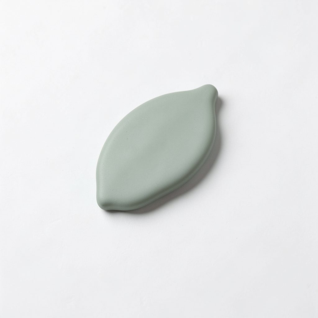
Matte ceramic should usually provide the softer counterpoint. Its powdery surface absorbs light, allowing the eye to pause after moving across stone. Look for a vessel with an irregular rim, a sculptural lamp base, or a bowl with a dry, chalky glaze. The handmade quality keeps the arrangement from feeling like a showroom display.
Glossy glass is best used as a precise accent. A coloured tumbler, small Murano-style object, or smoked-glass vase can repeat a room’s dominant colour without adding bulk. The design topics gathered by The Accessorator offer useful visual prompts when considering how art, objects, and furnishings can sit together.
Build A Restrained Colour Story
Material contrast becomes more convincing when the palette is edited. Begin with two quiet foundation colours, then add one stronger shade through glass or a smaller ceramic piece. Warm white, sand, olive, charcoal, and dusty blue are particularly forgiving combinations for Australian interiors, where sunlight can make saturated colours appear even more intense.
A pale honed stone beside terracotta ceramic creates a grounded, sunbaked feeling. For a cooler scheme, pair grey marble with blue-grey pottery and smoke-tinted glass. If the stone contains veining, borrow one colour from that pattern rather than introducing several unrelated tones.
Pattern deserves the same discipline. A graphic rug, checked cushion, or botanical textile can sit comfortably near these hard finishes, provided the pattern is not competing with dramatic stone veining. A single patterned object often has more impact than a collection of small motifs scattered across the room.
Use Light As A Decorative Tool
Glossy glass changes throughout the day. In a Melbourne terrace with late afternoon sun, a cobalt vessel may cast a blue note across a shelf; in a Brisbane apartment, bright humidity-softened light can make clear glass appear almost weightless. Place reflective pieces where they can catch a window, artwork, or lamp rather than pointing them towards a blank wall.
Polished stone also benefits from directional light, though it needs restraint. A concealed strip light beneath a shelf can reveal veining, while a table lamp with a fabric shade will create a gentler glow across a stone tray. Avoid lighting every reflective object equally, or the arrangement may become visually busy.
A little digital inspiration can help explain why a small glint attracts attention so quickly; even this playful digital reference points to the power of contrast, anticipation, and a clearly placed highlight. In a room, the same principle means one glossy object should act as a spark, not turn the whole display into a mirror.
Arrange Objects For Australian Living
Australian rooms often move between indoors and outdoors, especially in Brisbane, the Gold Coast, and coastal New South Wales. That connection favours durable, tactile materials: stone that can handle a busy family zone, ceramic with a substantial base, and glass used where it will not be knocked by an open door or passing pet.
In a compact Melbourne apartment or a renovated Sydney terrace, use a shallow stone tray to group objects and give them a defined footprint. Place the ceramic vessel slightly off-centre, then position glass nearby but not directly in front of it. This creates depth while preserving an easy path for dusting and everyday movement.
A windowsill can become a small still life rather than an afterthought. A guide to growing kitchen herbs demonstrates how practical greenery can share space with designed objects. Try a matte ceramic herb pot with a polished stone coaster and one narrow glass bud vase, keeping the arrangement useful as well as decorative.
Balance Texture, Shape, And Scale
Surface is only one part of the composition. Shapes should vary too. Pair a round ceramic form with a rectangular stone slab, then introduce a tall glass cylinder or a narrow bottle. This combination creates a gentle rhythm without requiring a large number of objects.
Scale should follow the furniture. On a broad timber dining table, several related pieces can form a low landscape. On a narrow console, one substantial stone object and two smaller pieces will look more assured than six tiny ornaments. Leave enough empty space for each finish to register clearly.
A quick editing list can make the arrangement easier to judge:
- One dominant material
- One soft, absorbent surface
- One reflective accent
- One area of visible negative space
Consider the room’s practical habits before committing to a delicate display. A glossy glass object may be perfect on a high shelf but unsuitable beside a frequently used sofa arm. In homes with children, pets, or a lively arvo entertaining routine, choose heavier ceramic and place fragile glass behind a visual or physical boundary.
For a final check, look for these signals:
- Highlights that are spaced apart
- Colours repeated in small doses
- Contrasting heights
- Textures visible from the doorway
Make The Mix Feel Collected
The most successful arrangements rarely look purchased in a single afternoon. Add evidence of time: a ceramic piece from a local maker, a stone object found at a design fair, or a glass vessel with a slightly unusual tint. Australian craft markets and gallery shops are especially useful for finding work with small variations that give a display character.
Furniture can provide another layer of contrast. A polished stone object on raw or wire-brushed Australian timber feels more relaxed than the same object on a high-gloss lacquered cabinet. A matte ceramic lamp beside a reflective metal frame can bridge the gap between domestic comfort and gallery-like precision.
| Material | Visual Effect | Best Companion | Useful Placement |
|---|---|---|---|
| Polished stone | Weight, veining, crisp highlights | Matte ceramic or timber | Console, coffee table, kitchen island |
| Matte ceramic | Softness, tactility, handmade character | Polished stone or woven textile | Shelf, bedside table, open display |
| Glossy glass | Reflection, colour, lightness | Stone or quiet neutral surfaces | Window, lamp-lit shelf, dining table |
Edit The Room With Confidence
Step back before adding anything else. If the stone is already dramatic, keep the ceramic simple and let the glass repeat a small colour detail. If the room has plenty of timber, linen, and woven texture, a more polished stone or saturated glass piece may provide the necessary lift.
The aim is not perfect uniformity; it is a sequence of sensations. Let one object catch the eye, another invite touch, and a third shift with the light. For further visual references on artful accessorising, browse The Accessorator and use those observations to refine one shelf, table, or windowsill at a time.